Search the site...

  phil mora
  • The Global Nomad
  • About
  • Portfolio
  • Contact and Book
  • The Training Log
  • The Global Nomad
  • About
  • Portfolio
  • Contact and Book
  • The Training Log


​The Global Nomad
(JAN-MAR 23 = PHILADELPHIA)

about

Twitter's quiet metamorphose

2/5/2014

0 Comments

 
Picture
Picture
Picture
Picture
Twitter has over 200 million active users. It has changed the way major news and personal information is spread and dissected. So far Twitter has stayed remarkably dedicated to its original interface, taking a hands-off approach to how its 230 million users want to use it. 

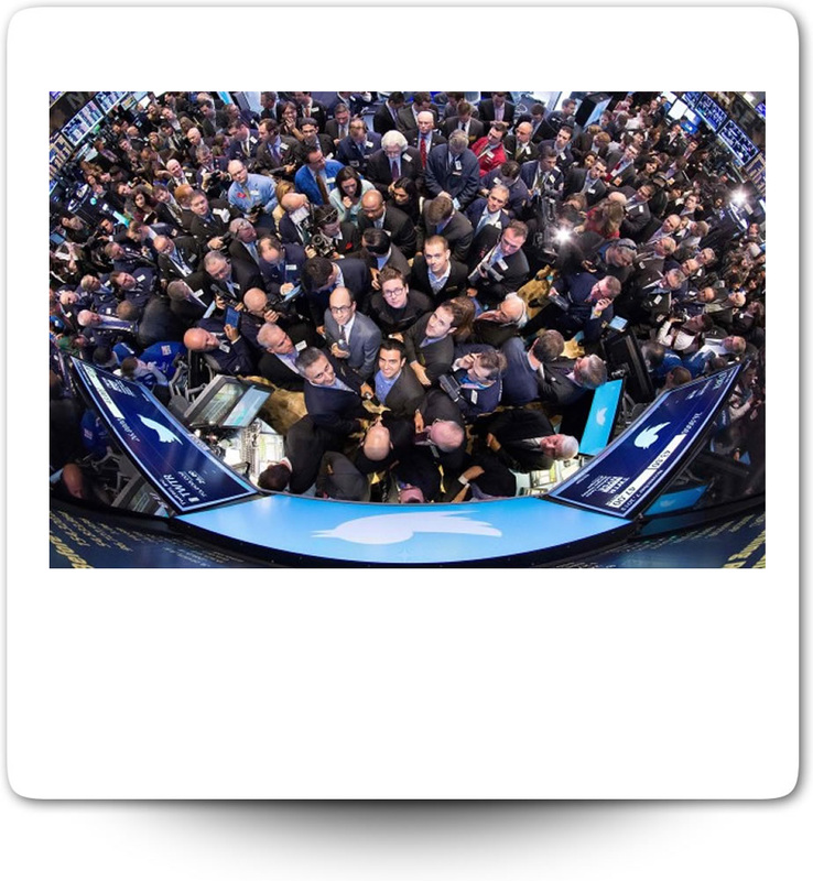
But it will soon have another powerful bunch of people—investors—who also want to be heard: in the near term, Twitter may make major interface changes to address the growing need to make money. 

-Philippe.
[Thank You MIT Technology Review | By Josh Dzieza 11.05.13]

Twitter underwent one of the biggest redesigns in its seven-year history, but you’d be forgiven for missing it. Embedded images and video are now displayed automatically in the updates you see, instead of requiring a click to expand and view. 

Buttons for “retweeting,” “replying,” and “favoriting” tweets were also brought to the surface, cutting in half the number of clicks needed to interact with a tweet.

Which is not to say the changes are insignificant. Indeed, they are a sign of things to come, as Twitter tries to balance its simple appeal and the demands of its users with a growing need to make money.

As Twitter nears its IPO, the new presence of images and videos may help woo people currently using Instagram, Snapchat, or other rapidly growing social photo-sharing services. They certainly make Twitter more appealing to advertisers: previously users would have to click on a promoted tweet to see an image; now it’s in your face. (After the update, some people joked that Twitter just launched banner ads.) The newly prominent social buttons will also encourage more interaction, making it easier for Twitter’s many lurkers to engage, and lowering the threshold for tweets to go viral.

Twitter has been signaling for some time that a more radical redesign is imminent. As a soon-to-be publicly traded company, it needs to increase users, and one way to do that would be to find a way of diminishing the number of people who sign up for Twitter, can’t figure out what to do with it, and never come back. Last month a Reuters/Ipsos poll found that 36 percent of people who joined Twitter say they don’t use it, citing a lack of friends on Twitter, and confusion over how to use it and what it was for, among other reasons. In comparison, only 7 percent of Facebook members say they don’t use the site after signing up. Possibly the rumored television stream—a separate column for people discussing television shows, and for broadcasters to promote shows, and for companies to place ads across both screens—could serve this purpose without disrupting the main feed. And possibly Twitter could continue its attempts to recommend content it thinks people will be interested in, carrying on the work of the neglected Discover tab—a personalized stream of top stories and tweets that will reportedly be cut—in some other form.

But the Discover column’s neglect indicates an important challenge for Twitter. Its users are reluctant to take too much heavy guidance, and they have the perfect venue for venting their displeasure if they disagree with changes. Even the minor addition of blue lines to sort Twitter conversations into groups elicited a backlash, though that appears to have faded. Twitter is also driven disproportionately by the activity of a small coterie of power users, some of whom have several million followers.

Twitter’s light touch with redesigns shows that it knows this. The challenge will be keeping this in mind going into the IPO—as pressure to make money inevitably increases.

In contrast to Twitter, Facebook has undergone major overhauls of its user interface several times, each of them usually accompanied by howls of outrage and petitions (on Facebook) to roll them back. Twitter looks extremely similar to when it launched in 2006. Many of Twitter’s redesigns amounted to adjusting its interface and features to better accommodate things its users are already doing, rather than foisting new features upon them. Some of Twitter’s most iconic features, like the hashtag and retweet, were first created by users before Twitter built them into the architecture of the site.

“Facebook tends to build what they want for their users rather than listening to users and building what they want,” says Brian Blau, an analyst who covers Twitter for Gartner—“not that one is good or bad.” He attributes the difference partly to the two sites’ different goals: “Facebook has much broader ambitions, to connect the world, and when you say that you can think about different ways of connecting people—the wall, timeline, news feed. You can change the user interface, and people may not like it, but they like being on Facebook so they tolerate it, and now they don’t remember.” Facebook, it’s worth pointing out, is more embedded in users’ real-world social lives, making it harder to quit or ignore.

Twitter, he says, has stayed very focused on a single pillar: real-time, short-form communication. It has kept its focus even though Twitter’s original constraint, the 140-character limit, was a limit imposed by the SMS texting the site originally used, and no longer applies.

“Twitter’s beauty is its simplicity and its creativity is its constraint, 140 characters,” says S. Shyam Sundar, the founder of the Media Effects Research Laboratory at Penn State. When your form is your function, Sundar says, it creates certain constraints when it comes to redesigns. You can add videos and images and shortened links to tweets, but if you touch the format of short messages presented in a reverse-chronological stream, Twitter won’t be Twitter.

So far, when Twitter has made design tweaks, it has tended toward giving users greater latitude in how they use the site rather than directing them how to use it (as Facebook might do). When the first Twitter users signed on, the site prompted them with the question, “What are you doing?” As Twitter moved from a microblogging platform often mocked for its mundanity to a place where people posted about news and events, that injunction was swapped out for the more open ended, “What’s happening?” Today it’s simply, “Compose a new tweet.”

As people started using Twitter as a way to share and discover hyperlinks to interesting content as much as a blogging platform, Twitter accommodated them, developing its own URL shortening service. After images became one of Twitter’s major functions—the twitpic of the plane that crash-landed in the Hudson River was a turning point—it decided to host its own photos. Even the “trending topic” chart in the margin, a major new feature in 2009, simply gave a more prominent location to information about what was already happening on Twitter.

So far Twitter has stayed remarkably dedicated to its original interface, taking a hands-off approach to how its 230 million users want to use it. But it will soon have another powerful bunch of people—investors—who also want to be heard. 

Read More: http://www.technologyreview.com/news/521016/twitter-must-metamorphose-carefully-as-it-goes-public/
Why Twitter needs a design reset
[Thank You Monday Note | By Frederic Filloux 02.03.14]

Twitter is the archetype of a greatly successful service that complacently iterates itself without much regard for changes in its uses. Such behavior makes the service -- and others like it -- vulnerable to disruptive newcomers.

Twitter might be the smartest new media of the decade, but its user interface sucks. None of its heavy users is ready to admit it for simple reason: Twitter is fantastic in broadcast mode, but terrible inconsumption mode. Herein lies the distortion: most Twitter promoters broadcast tweets as much as they read them. The logical consequence is a broad complacency: Twitter is great, because its most intensive broadcasters say so. The ones who rarely tweet but use the service as a permanent and tailored news feed are simply ignored. They suffer in silence -- and they are up for grabs by the inevitable disrupter.

Twitter's integration can't be easier. Your Tweet it from any content, from your desktop with an app accessible in the toolbar, or from your smartphone. Twitter guarantees instant execution followed by immediate gratification: right after the last keystroke, your tweet is up for a global propagation.

But when it comes to managing your timeline, it's a different story. Unless you spend most of your time on Tweeter, you miss many interesting items. Organizing feeds is a cumbersome process. Like everybody else, I tried many Twitter's desktop or mobile apps. None of them really worked for me. Even TweetDeck seems to have been designed by an IBM coder from the former Soviet régime. I looked around my professional environment and was stunned by the number of people who acknowledge going back to the basic Tweeter app after unsuccessful tries elsewhere.

Many things are wrong in the Twitter's user interface and it's time to admit it. In the real world, where my 4G connection too often falls back to a sluggish EDGE network, watching a Tweeter feed in a mobile setting becomes a nightmare. It happens to me every single day.

Here is a short list of nice-to-have features:

-- Background Auto-refresh. Why do I have to perform a manual refresh in my Twitter app each time I'm going to my smartphone (even though the app is running in the background)? My email client does it, so do many apps that push contents to my device. Alternatively, I'd be happy with refresh preset intervals and not having to struggle to catch up with stuff I might have missed...
Speaking of refreshes, I would love to see iOS and Android coming up with a super-basic refresh system: as long as my apps are open in the background, I would have a single "Update Now" button telling all my relevant apps (Email reader, RSS reader, Twitter, Google Current, Zite, Flipboard, etc.) to quickly upload the stuff I'm used to read while I still have a decent signal.

-- Save the Tweet feature. Again, when I ride the subway (in Paris, London or NYC), I get a poor connection - at best. Then, why not offer a function such as a gentle swipe of my thumb to put aside a tweet that contains an interesting link for later viewing?

-- Recommendation engine. Usually, I will follow someone I spot within the subscriptions of someone I already follow and appreciate. Or from a retweet. Twitter knows exactly what my center of interests are. Therefore it would be perfectly able to match my "semantic footprint" to others’.

-- Tag system. Again, Twitter maintains a precise map of many of its users, or at least of those categorized as "influencers". When I subscribe to someone who already has thousands of followers, why not tie this user to metadata vectors that will categorize my feeds? Overtime, I would built a formidable cluster of feeds catering to my obsessions...

I'm puzzled by Twitter’s apparent inability to understand the needs of the basic users. The company is far from unique in this regard.; instead, it keeps relying on a self-centered elite of trendy aficionados to maintain the comfy illusion of universal approval - until someone comes up with a radical new approach.

This is the "NASA/SpaceX syndrome". For decades, NASA kept sending people and crafts to space in the same fashion: A huge administrative machine, coordinating thousands of contractors. As Jason Pontin wrote in his landmark piece of the MIT's Technology Review:

In all, NASA spent $24 billion, or about $180 billion in today’s dollars, on Apollo; at its peak in the mid-1960s, the agency enjoyed more than 4 percent of the federal budget. The program employed around 400,000 people and demanded the collaboration of about 20,000 companies, universities, and government agencies.

Just to update Pontin's statement, the International Space Station cost $100bn to build over a ten years period and needs about $3bn per year to operate.

That was until a major disrupter, namely Elon Musk came up with a different way to build a rocket. His company, Space X, has a long way to go but it is already able to send objects (and soon people) to the ISS at a fraction of Nasa’s cost. (Read the excellent story The Shared Genius of Elon Musk and Steve Jobs by Chris Anderson in Fortune.)

In the case of the space exploration, Elon Musk-the-outsider, along with its "System-level design thinking powered by extraordinary conviction" (as Anderson puts it), simply broke Nasa’a iteration cycle with a completely different approach.

That's how tech company become vulnerable: they keep iterating their product instead of inducing disruptionwithin their own ranks. It's the case for Twitter, Microsoft, Facebook.

There is one obvious exception - and a debatable one. Apple appears to be the only one able to nurture disruption in its midst. One reason is the obsessive compartmentalization of development projects wrapped in paranoid secrecy. Apple creates an internal cordon sanitaire that protects new products from outside influences - even within the company itself. People there work on products without kibitzing, derivative, “more for less” market research.

Google operates differently as it encourages disruption with its notorious 20% of work time that can be used by engineers to work on new-new things (only Google's dominant caste is entitled to such contribution). It also segregated GoogleX, its "moonshots" division.

To conclude, let me mention one tiny example of a general-user approach that collides with convention. It involves the unsexy world of calendars on smartphones. At first sight not a fertile field of outstanding innovation. Then came PeekCalendar, a remarkably simple way to manage your schedule (video here) on an iPhone.


This app was developed by Squaremountains.com, a startup created by an IDEO alumni, and connected to Estonian company Velvet. PeekCalendar is gently dismissed by techno-pundits as only suitable for not-so-busy people. I tested it and - with a few bugs - it nicely accommodates my schedule of 25-30 appointments a week.

Showing this app during design sessions with my team at work also made me feel that the media sphere is by no mean immune to the criticism I detailed above. Our industry is too shy when it comes to design innovations. Most often, for fear of losing our precious readership, we carefully iterate instead of seeking disruption. Inevitably, a young company with nothing to lose nor preserve will come up with something new and eat our lunch. Maybe it's time to Think Different™.

frederic.filloux@mondaynote.com
@filloux

0 Comments


Leave a Reply.

    head of product in colorado. travel 🚀 work 🌵 food 🍔 rocky mountains, tech and dogs 🐾

    Picture

    Categories

    All
    Change Agents
    Experiences
    Fitness
    Hacking Work
    Technology

    RSS Feed

Phil Mora
​San Francisco .Rennes .Fort Collins .Philadelphia
Phone: (415) 315-9787 . Twitter
@philippemora .  braintrust | polywork | behance

Copyright © 1999-2023 Marshall Tucker by Bold (MT2B) All Rights Reserved